“Design Disruptors” – A Lesson In Design

designdisruptors

Design Disruptors, a film produced by design management and collaboration platform InVision, covers several fundamental principles of art and design. Like us, design is human and stems from what people need or want. This serves as the basis for all design –  the struggle for conveniency is what pushes new inventions to come to fruition. With this push, designers must make sure they are abiding by these standards in order to solve interactive problems more efficiently.

The concept of disruption defines a designer’s confidence in action. This term correlates with risk-taking, an entrepreneurial venture in business. Disruption creates a wave of opportunity for all designers, opening up doors for new ideas.

Throughout the film, we are given many lessons in problem-solving. As designers, it’s essential we perfect our problem-solving skills in order to produce an easy-to-use, efficient product. Mind-sharpening techniques like setting personal deadlines for yourself is a very productive trait to have. Two heads are better than one – group sessions also help designers in coming to a conclusion with an idea or concept. These methods have proved to be constructive in the everyday workplace.

Regarding user reviews, some mediums significantly differ from one another. User interface design has an advantage over print media. For example, print media such as newspapers and magazines doesn’t entail feedback. With web records and database archives, it is easier to maintain user interest by eliminating or adding certain features.

Speaking of user satisfaction, it is imperative designers fulfill the needs of their consumers on a universal scale. Building something everyone can use markets your product to the largest possible audience – the world. And it gets designers adapting to global user interests rather than their own personal interests.

Ultimately, designers should strive for practicality in their work. What is the easiest and most simple way to get the job done? It’s about creating solutions that are so efficient, they’re almost peripheral to the user. Competition breeds disruption, and it’s always happening. It helps reform design.
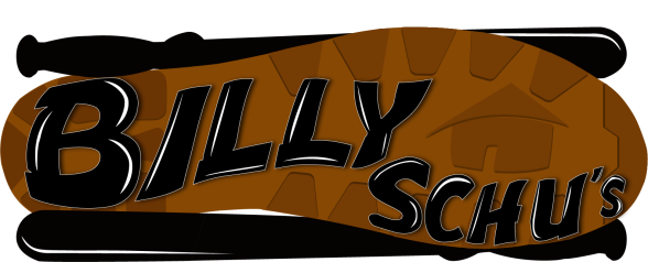
Posted in Writing | Tagged , , | Leave a comment

Shoe Tapping Audio/Video Syncing – Max Documentation

gb

Tapping your shoes on the floor has never been so stimulating.  This big, interactive idea encompasses the manipulation of visual display through physical exertion of the feet.

input

Hit the keys on the in-program MIDI input and you will activate the program’s catalyst. This MIDI input acts as a substitute for the tap of the shoe. It is simply an alternative manual input, in place of shoe tapping, for the patch. Sometimes, creators must compromise certain aspects of their design and a MIDI is a fit compromise. Every note triggers the rest of the patch to activate.

Screen Recording

Connected to four separate oscillators that are to be toggled on and off, MIDI notes run through these gated circuits and are manipulated by the oscillation they’re filtered by. Each have a distinct effect on the final audio result.

graph

In having further control, manipulating vertices on the line graph also affects the output to a greater extent, providing different delay and attack values like a mixer would. Delays between each of the value shifts emulate the tapping of a shoe. The graph allows for complete control over every and any value, making the room for variance that much more complex.

audio

In order to hear anything, we have to enable sound to come through by raising our gain. Additionally, we need to toggle on the audio output. This will also allow us to affect our visual display.

visual

And finally, our end result takes the form of visuals affected by waveform. With every note played, or foot tapped, displays and sounds are distorted. Now we have a full system of input affecting output.

Ultimately, a system like this one could have several implications for society. We could see this system being used for the blind as an additional receptor for navigation. As there are plenty of probing canes used already for the blind, audio may also play a small role in the process. Attaching a receptor to the end of the cane can allow for sound to emit from the device, further adding to the identification of barriers and pathways.

For runners, this could allow for a pacemaking machine. As an avid runner myself, I always find myself inconsistent with my mile pacing. If this shoe-laced device was ever patched to headphones in some way, runners could have an auditory representation of their pacing, distributing their velocity among laps.

Whether for the disabled on one side or athletes on the other, this pressure-to-auditory/visual system could come in handy. We should take advantage of these systems in the future and advance further in the realm of patching.

Posted in Interactive | Tagged , | Leave a comment

“Hostage” – Movie Poster

was

This is actually a very recent addition to my portfolio. And it’s something I call Hostage. It’s a composite image including two versions of myself – a hostage and a thug. I intended to produce an action-thriller movie poster filled with a sense of suspense. I had fun posing for these photos as both subjects, in which I would manipulate their positioning in order to create an interesting composition.

What I try doing here is setting up a scene that ties itself together nicely. We as an audience understand this image is promoting a movie where someone is being held hostage, and it seems to be the main plot of this film. I worked to utilize a strong sense of motion through sharp diagonals and blurred borders. But ultimately, I wish to build hype within the compositions I produce advertising these hyped-up films.

Posted in Best Work, Non-Timebased | Tagged , , | Leave a comment

Sound Project

In these videos, I add audio to my three most recent videos. Both of my motion graphics videos as well as my narrative video now attains sound effects.

My Princess Grace adaptation emits low frequencies of rhythm combined with the rush of morning traffic to create sound riding on the verge of a headache – the very ailment Grace suffered.

In this three-dimensional countdown created in Adobe After Effects, I produce a ten-second video with numbers that count down from ten. Crimson in color, my shifting background sets the stage for the animation’s environment. Each number consistently rotates rightward on its y-axis, seamlessly transitioning to the next number with each turn. Centered, title-safe positioning keeps it balanced while the consistent movement retains a somewhat mesmerizing rhythm among each turn. The swift rotations are accompanied by smooth swoosh sounds, applying a weighted sense of heaviness to the object.

Countdowns entail simplicity – for the sake of following each number as it transitions to another. I made sure severe complexity wasn’t a factor in this production. Numbers were flat-surfaced easy to read, which I believe is so very essential in getting your point across.

In my Billy Schu’s logo animation, capturing the correct sound for each movement was key. Clashing with the silverware, swooshing with the light sweep.

Posted in Time-Based | Tagged , | Leave a comment

Interactive Design Gallery Write-Up #2 – “Core Sample: Additional Findings”

On April 9th, 2017, I visited Alfred University’s Ceramic Art Museum to see Core Sample: Additional Findings – an exhibition outlining the historical timeline associated with ceramic art. Showcasing artwork produced by international ancestors as well as local artists, this gallery shows off a multitude of perspectives and emphasizes the element of depth.

Allusians-of-Reality-Arrangement-1---Piece

Allusians of Reality: Arrangement 1, 2016

In Allusians of Reality: Arrangement 1, Hannah Thompsett uses shape and texture to convey a false sense of depth unto a flat object. Fiberglass and aluminum both contribute to the 2D illusion. In several ways, we can relate this certain features within an HTML document.

Our body’s background is essentially two-dimensional. We may sometimes create an illusion of depth throughout its contents, aiding to our website’s overall appeal. In its true essence however, we are simply instilling 2D elements within a document. Glancing at these rectangles from a distance, I hadn’t anticipated crumpled paper taking up geometric forms. Once altering my perspective, I realized that it was aluminum being smushed between two sheets of fiberglass. This composition resembles the raster screens we lay our eyes on every time we open our laptop lids or power on our phones. Depth, while it can be further brought about through parallax, is illusionistic in its digital presentation.

untitled-l-wall---Piece.png

untitled|wall, 2013

Layered in nature, untitled|wall, produced by Brian Caponi, plays upon the z-index of a page. Here we can see five or six layers of hooped porcelain configured in a rectangular surface. We know that, like parallax, we can manipulate viewers’ perceptions of depth by distancing space between what comes first on the z-axis. This work is a great representation of that.

Unlike Allusians of Reality: Arrangement 1, this work utilizes real, living depth. It acts as a sequence of perforated blankets losing clarity the further back they go. Similarly, a webpage attains these same attributes, and I will need to keep these relationships in mind when developing my web aesthetic.

Depth is everything when you consider what it does for the viewer. It can make or break the appeal of a website. Sometimes you’re approach may be in-your-face and confrontational – and in other moments, you may want to give your user space with great depth. Both aforementioned artists allow us to reestablish our preconceptions about depth through fairly simplistic demonstrations. Each piece brings to light the efficiency of maintaining strong texture habits that ultimately benefit web design.


Posted in Lectures & Workshops, Writing | Tagged | Leave a comment

Art History 2 Gallery Write-Up #2 – “A Day’s Work”

Last Saturday, April 1st, I visited Alfred University’s Cohen Gallery to see A Day’s Work, an exhibition created by Rebekah Modrak and Nick Tobier. Both videographers displayed two separate productions in which authenticity and social expectations are challenged.

In Re Made / Best Made, Modrak satirizes a New York City-based company, Best Made Company. This business sells painted axes, as well as a quantity of other outdoor consumer products under a rugged identity marketed toward working-class men. Through claims of authenticity, Best Made Company has worked to strengthen their manly narrative.

“Re Made Company”, a fictional business duplicating Best Made Company’s branding efforts is, like the video above, parody. Unlike Best Made Company, however, Re Made Company is in the line of selling plungers, not axes. Accompanying this, Modrak has also produced a website and a Facebook page, taking her commentary to an entirely new level.

Regarding Modrak’s strong aesthetic execution, replication of Best Made Company’s commercial efforts is practically infallible. Concerning the dialogue, background environments and even motion graphics, we see a great degree of thought went into resembling the initial set – something I believe is very effective in any parody.

Evidently holding some root in Dadaism, this production draws potent parallels with Marcel Duchamp’s readymade sculpture entitled Fountain. In both cases, our artists are taking bathroom appliances, like plungers or urinals, and exalting them for parody. Works along these lines question the authenticity of various art styles and consumer products.

In Marvelous Guests, Tobier explores the dynamic between the host and the guest. Together, the two can make something worth witnessing – like cheese and a pizza, like a drumstick and a drum. Tobier takes certain professions and isolates them within an unfamiliar environment. For example, in an edition conducted five years ago, Tobier implements a pair of stretching ballerinas in a laundromat. Sampling them from their ballroom, these dancers hold little to no relevance with their locations – with this, viewers can see the raw, naked essence associated with these out-of-the-ordinary happenings to a greater degree.

Marvelous Guests challenges the social expectations surrounding an environment and purposes itself in creating an appealing combination between the guest and the host. Weightlifting in libraries, practicing tai chi in coffee shops, playing percussion at gas stations; each of these unusual combos allow for new, interesting relationships to develop and unfold.

Neo-Dadaism concepts of experimentation hold much prevalence with each edition of the series. Reactions from pedestrian passer-bys play a crucial role in capturing the art form; a large part of the craft relies on the role of chance – a playing off of happenstance – in observing the external reactions from others. Much like John Cage and his 4’33”, the viewers’ response is just as important to the production as is the action.

Ultimately, both Modrak and Tobier challenged notions of authenticity and normalities outlining social framework. They act as pioneers, continuing to push the avant-garde into new and exciting places. And interestingly enough, these artists worked to think outside the box, using methods of duplication and hidden cameras to convey a specific message and/or idea. All in a day’s work.

Posted in Writing | Tagged , | Leave a comment

Billy Schu’s Logo Motion Graphics

newlogo

Working off the above logo I created for Billy Schu’s Food Bar earlier this semester, I chose to animate this into something that could potentially be used for their own commercial use.

In this version, I have the logo arrive then disappear. Here, I captured the swiftness and efficiency of quick motion. As swift as each object of silverware cuts each other to make an “X” is as swift as it makes its exit.

In this version, the logo is seamlessly looped to go on forever and ever, contracting then expanding continuously. This may be a good addition for Billy Schu’s to incorporate on the lower-right side of their commercials.

Posted in Best Work, Time-Based | Tagged | Leave a comment

(In)Voluntary Memories – Art History 2 Gallery Write-Up #1

Last Thursday, February 23rd, I attended the premiere of (In)Voluntary Memories – an exhibition hosted by Alfred State’s Bret Llewellyn Gallery. Alysia Kaplan, its creator, attempts to explore the concept of memories and their inclined nature of becoming rewritten. When returning to her hometown of Rochester, Kaplan claims she’s felt “dislocated” with the area. It’s environment is foreign to her, and it’s triggered her to question whether or not her perception can be internally manipulated over time.

kaplan

“No matter what an image contains, we have a tendency to put ourselves in it.” – Kaplan stated this in regard to the images above, and it’s an idea I’m certain most of us can relate to. What I take away from the flowers may be different than what someone else takes away from them. Subjectivity is the prime philosophy of this exhibition; meaning derives from the audience, not the artist. And with this, we can see Kaplan’s postmodernist roots showing through. Resembling Dadaism, Kaplan provokes consumer thought, forcing her viewers to create their own interpretations.

Kaplan believes memories are a universal language and to ignore them is to deny ourselves. Sharing them to the world, we are likely to find someone else who has experienced something similar.

filmer

But just like old celluloid film however, our memories are subject to aging and disintegration. In her 16mm found footage video extracted from Visual Studies Workshop archives, Kaplan builds a story that plays on the nature of recognition. Consistencies between the worn authenticity of the film and the vintage sentimentality of memory make this sequence effective. Its documentation of personal history effectuates an interconnected sense of nostalgia, even if you hadn’t been the subject of experience.

Nostalgia – a word Kaplan has always struggled with. Often she is worried her work gets too precious, and I can see why. There were so many pieces in this exhibition that associate with the past. Black and white color schemes, film and photo scratches, themes of memory. It really can seem quite precious just thinking about it.

While her postmodernist style allowed us to speak for itself, there were several features that left me scratching my head. Kaplan conveyed an old, noir motif throughout much of the exhibition’s content. However, I feel as though a great deal of her artistic direction hadn’t quite been fully fleshed out.

How, exactly, one could empathize with several of the on-screen and on-canvas imagery without having experienced it is was left unanswered. Many connotate memories in the lens of old film – aged and desaturated. While Kaplan could easily associate the two, the presentation felt quite stereotypical and disconnected. Why must memory take this form? I don’t recall any of my real-life memories lacking color. It is this realization that weakens Kaplan’s intent.

Ultimately, the topic at hand is intriguing, just as the mind, in itself, is intriguing. Although Kaplan’s elements of design felt quite clichéd and disengaging, her conceptual presentation behind memories and their vanishing points came together with a purpose.

Posted in Writing | Tagged , | Leave a comment

“Industrial Composite” – Art Site

http://artsite-industrial.netlify.com/

This website centers itself around a very composite-heavy art style characteristic to me. Incorporating gears, wires and metal bars, this domain was constructed with several images that come together to create a harmonious interface. Navigation and color scheme is consistent among each page.

Posted in Interactive | Tagged , | Leave a comment